Overview
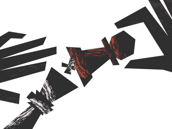
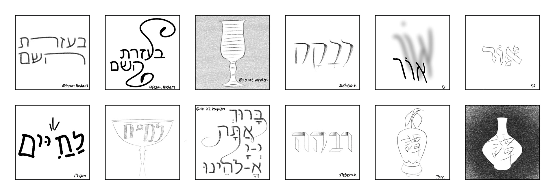
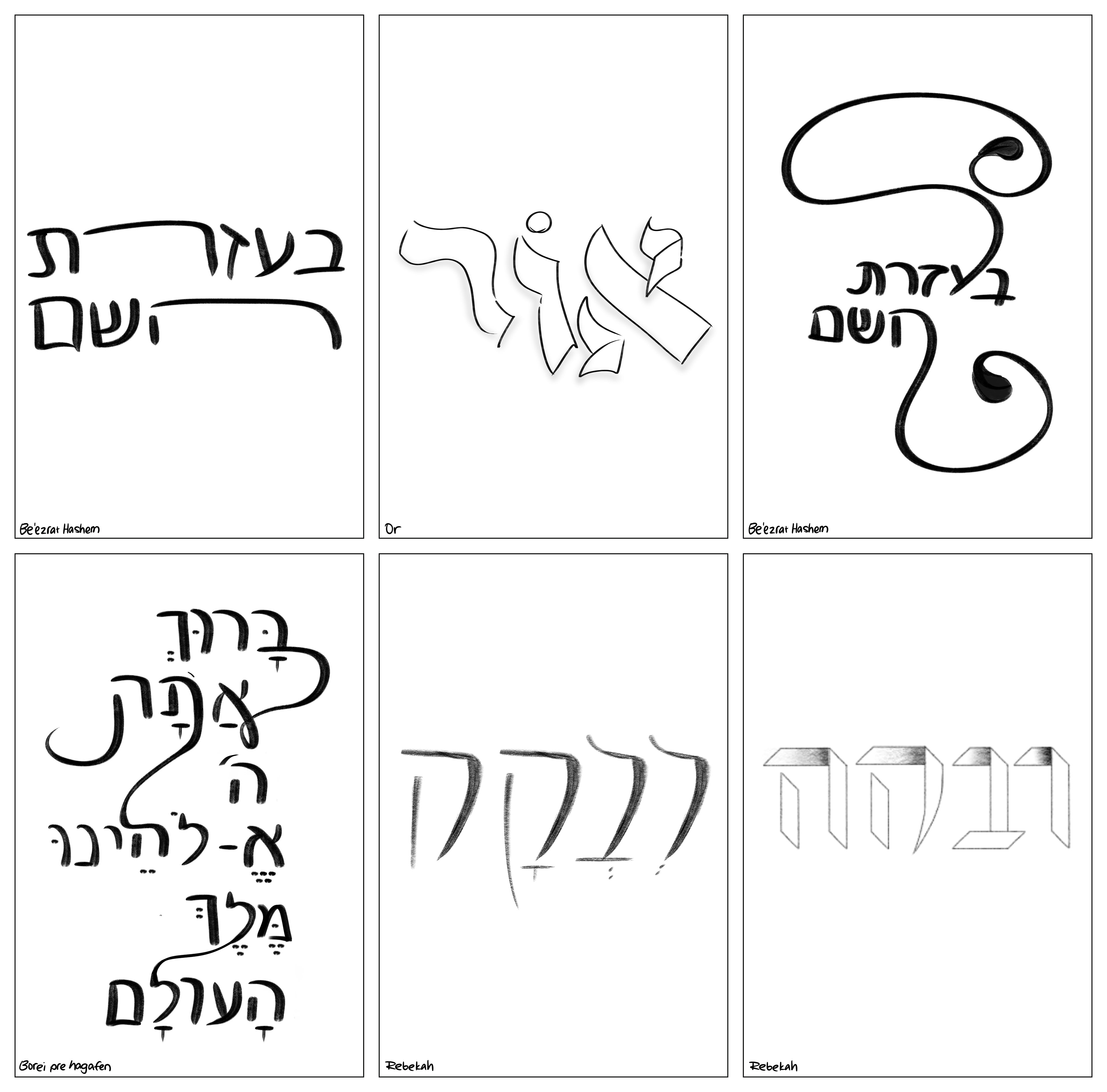
This typographic project explores the visual structure and expressive qualities of a non-Latin writing system. The project focused on viewing letterforms as visual elements, emphasizing their form, rhythm, and composition. Hebrew, standardized into its square form during the Second Temple period (516 BCE-70 CE), is a functional script that carries spiritual meaning.
Drafts
Final Design
Outcome
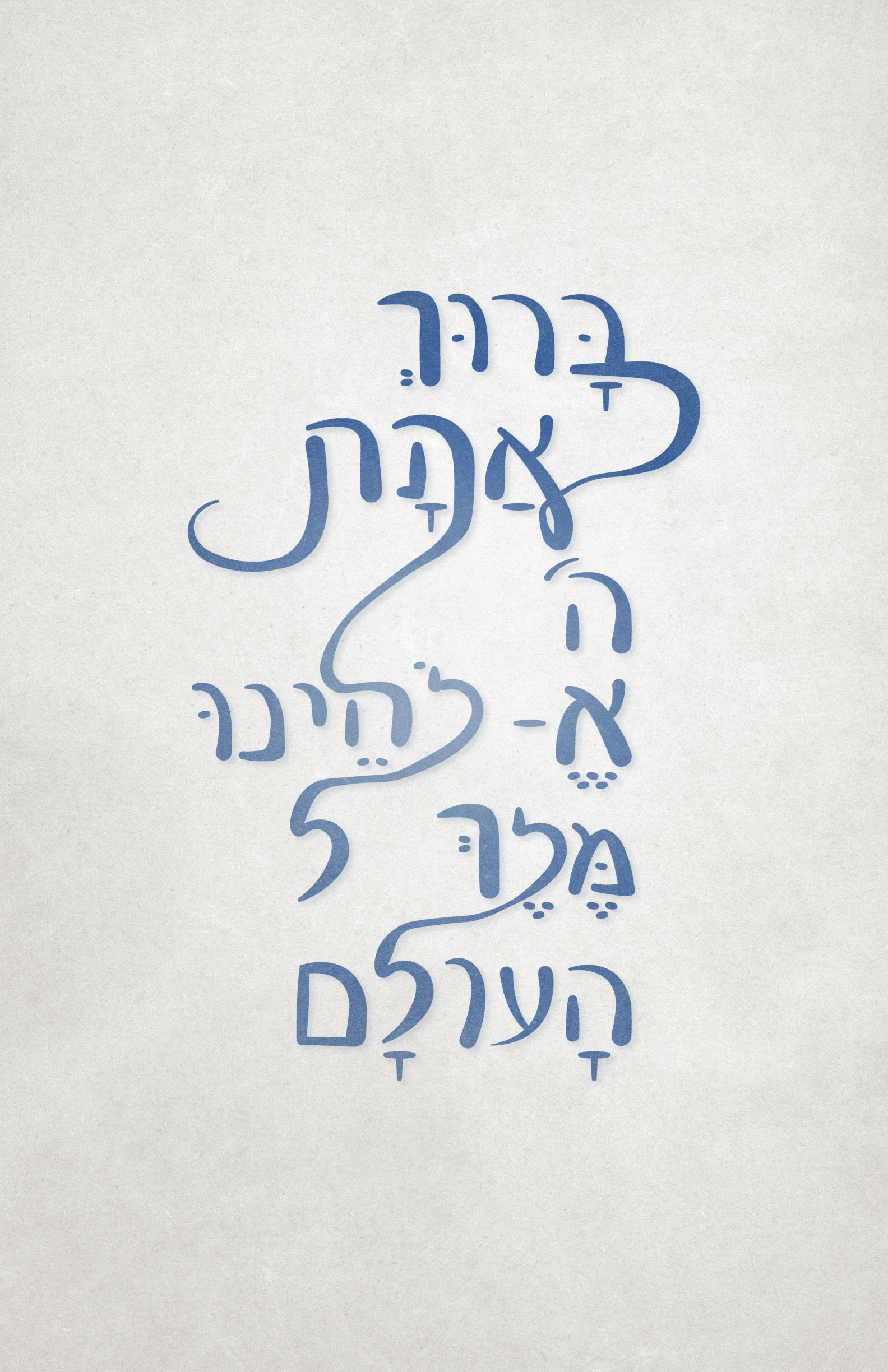
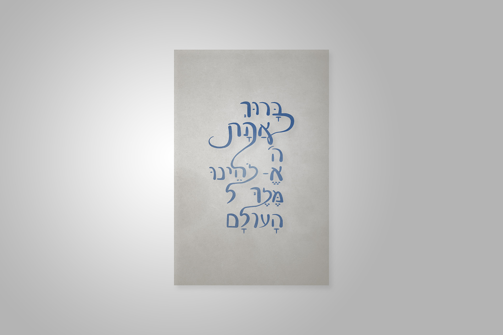
The final poster features the Borei Pri Hagafen blessing rendered in handwritten Hebrew, drawing inspiration from the script's traditional square form. Set in tekhelet blue on a parchment background, the design references traditional Judaica symbolism while maintaining a typography-first approach. Intentionally connected letterforms symbolize the continuity of faith and language across generations.